User Research on Mimo App
Role: UX Researcher
I worked on the product's core objectives and targeted audience for the context report and evaluation context, learnability of the evaluation critique, and made adjustments to the learners’ try-out, evaluation plan, and interview questions. I initiated data on the lessons learned from the try-out, conducted try-outs, compiled data collection, took charge of methods review under implementation, worked on the instruction portion of findings and recommendations, and contributed to the instruction under comparison of critique to evaluation.
Product Description
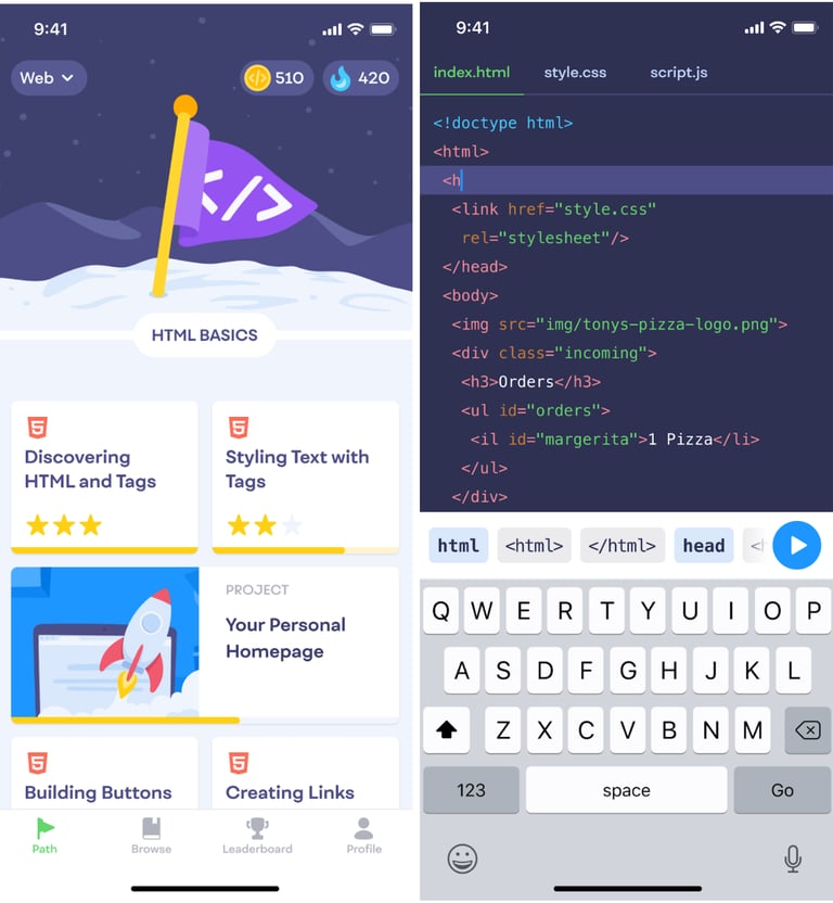
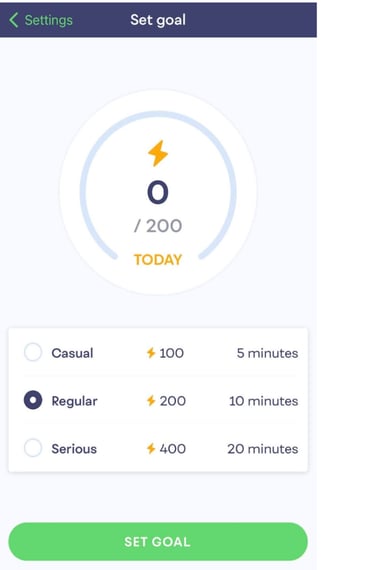
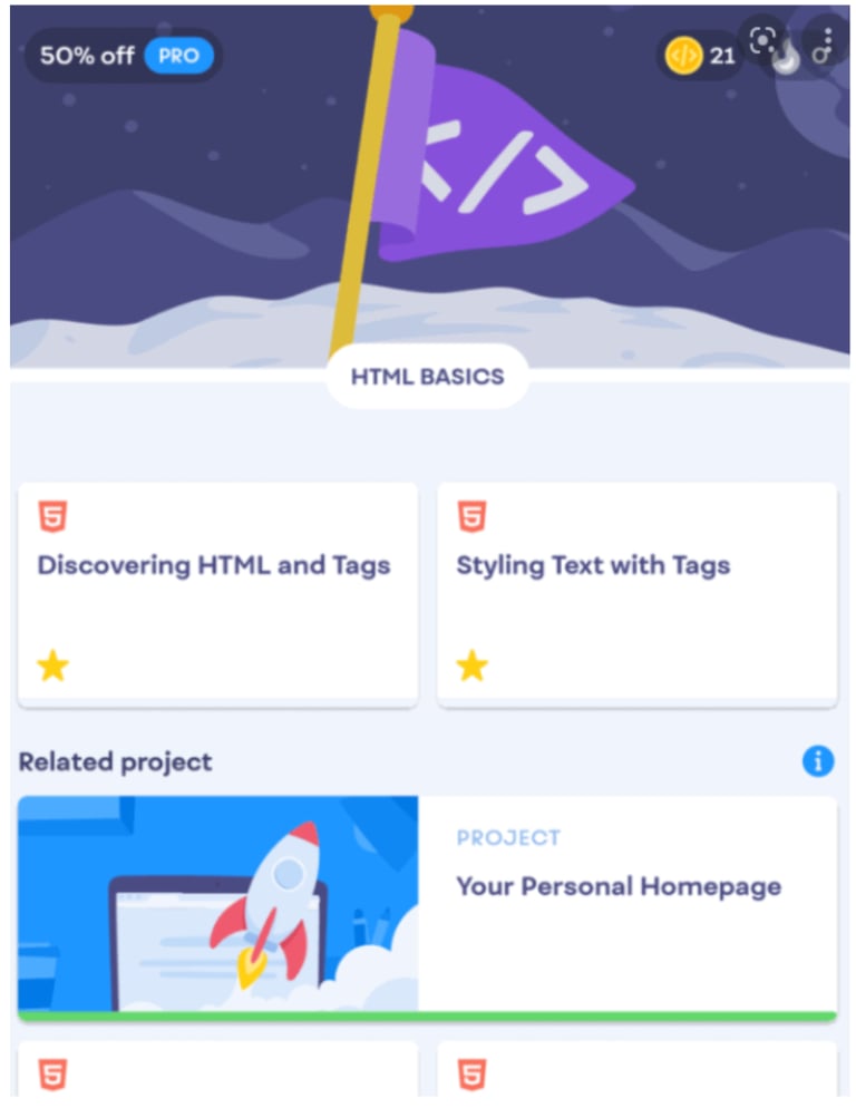
Mimo is an application available for both iOS and Google app stores and currently has 4.8 stars rating out of 35.8k ratings on the Apple store. Mimo teaches people how to code, build apps, websites, and more, in a fun, interactive, and engaging way. What stands out the most about Mimo is its ability to teach people who have any coding background, including those with zero experience. Another outstanding feature is the customizability of the commitment goal for each day on a chosen coding language. The app aims to teach anyone how to code HTML, CSS, JavaScript, Python, or SQL in a limited time each day to get closer to their learning goals. In the free version of the app, the user can still learn the above coding languages on the go through a mobile device to see how the app works suitably without having to commit a single penny. Instead of pursuing a one-size-fits-all approach like in most of the coding apps features, Mimo allows all aspiring coders to build their intended skills with a gamified system of receiving progress rewards. This competency helps users to stay committed throughout their learning journey.


Audience
The target audience for Mimo includes a broad demographic. Anyone with access to a device that has a connection to the internet can download and use the application. However, to narrow our focus we selected participants who were in their 20’s, three of which identified as male and three of which identified as female. Most of our participants had little to no experience with programming but a couple of them did have professional experience (but none with HTML experience). We specifically looked for participants who had at least some preliminary interest in learning to program to broaden their professional capabilities. In many cases that meant programming would help them better understand the software and tools they interact with at work, but in other cases, it would enable them to produce code to promote their own skills or to broaden a skillset they would actively use at work. To keep variables to a minimum, all the participants were English speakers, able-bodied, none of them had learning disabilities, and they had prior experience with mobile devices.


Outcomes
When determining the intended outcomes of this product, we focused specifically on the first module of the Web Development course since that’s what we expect to have time to formally evaluate. At a high level, we would expect students to be able to build a very simple webpage using HTML. Specifically, there are three different topics we expect an understanding of. First, users should know how and when to use doctype, html, head, and body tags to structure an HTML document. Second, they should know the purpose of various HTML tags such as paragraphs, headings, and buttons.
Aside from what they would specifically learn from the app, Mimo should excite users to continue learning. In our experience, programming can be seen as unapproachable or a hard skill to master. This app should both calm that fear and make users feel empowered to learn the material. We also believe this app intends to make the learning experience enjoyable and fun.
Mimo Effectiveness
When assessing the Effectiveness of Mimo, we focused on how the learning content meets the expectations of users and their ability to learn the material. Depending on programming knowledge prior to using the application, the effectiveness of the material of the application changes.
For the case of a beginner, with no knowledge of programming, the application provides adequate tools for becoming familiar with fundamentals such as terms and syntax. For example, the first few lessons when taking the web development course prompt the user to select what an HTML button tag looks like initially. Then, a second question might ask the user to select a closing tag from a list of options to complete the current half-completed button element provided in the question. A third question might ask what a provided HTML element would look like on a web page, providing examples to select from. For someone who doesn’t know what an HTML element is, they are beginning to understand what code makes that button possible and what correct syntax should look like. The application caters to learners who want to spend 5, 10, or 20 minutes a day learning programming as well, this provides a small and “bite-size” commitment to become familiar with programming.
In summary, this application is a tool that is most helpful for those without any prior experience, since it provides such fundamental lessons in the beginning. In order to fully understand the effectiveness of the learning material, studies to determine how many users found the material conducive to learning are necessary.

Evaluation Matrix Explanation
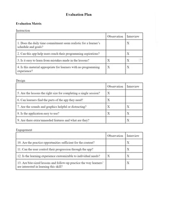
To determine what questions needed to be asked, we referred to research done over what would need to be included to fully assess an instructional app (Lee, 2015). The research was initially used to form a comprehensive rubric, but we transformed the criteria into questions in order to fit our format. Lee breaks the criteria into three different categories; instruction, design, and engagement. In our matrix questions 1-4 apply to the criteria formed around instruction, 5-9 apply to design concerns, and the final 10-13 are used to determine engagement similar to the rubric. There were a few questions that did not apply to our learners, such as criteria regarding the ability to teach learners at any level and ours are specifically those who have not had any experience with programming, so we intentionally did not include questions related to those.
We conducted both observations and interviews in order to answer the selected questions. Some of these questions regard usability aspects which are easiest to make judgments on by observing whether or not the learners struggle with them as they interact with the app, such as determining if learning from errors is useful or not. Additionally, questions regarding if the learners are able to use the app to successfully complete a goal, such as navigation or learning from errors, can be answered using observation and think-aloud protocols.
Some questions, however, don’t lend themselves well to observation and might not be included in what the participants say aloud even if they have thoughts on them. For that reason, we are also including an interview after the observation tasks are completed to delve further into things the participants might’ve said or answer some questions they may not have addressed yet. For example, we want to understand if this app teaches this subject matter in a way they would expect, but that’s something they’re unlikely to address when walking through tasks we’ve specified for them. We also want to specifically know about things if certain aspects are pleasing or distracting and some participants may note that, but others may feel that’s irrelevant to what we’re doing and keep such thoughts to themselves. Thus, an interview ensures we can fill in any gaps that the observation may not cover.
For both observations and interviews, a pitfall can come from trying to both write notes and listen to the participant at the same time. For that reason, we recorded both the observation and the interview in order to ensure our data is complete, unbiased of a notetaker’s view, and can be referred back to later in case there is a concern over interpretation. In no try-out did the learner ask not to be recorded. Additionally, we ensured the observation tasks are written in such a way that the user doesn’t get hints into the interface to avoid priming or leading the participants (Rubin 2008, 184) and that the interview questions are written such that they don’t imply a positive or negative answer to remove our own biases (Rubin 2008, 170).
.
Findings & Recommendations
Below are our 13 evaluation questions, split up by their topic. Under each question we’ve reported our findings and for each topic, we’ve included our recommendations.
Instruction
Does the daily time commitment seem realistic for your schedule and goals?
Participants find the daily time commitment realistic. The available options are 5, 10, and 20 mins for daily learning and participants have various chosen targeted times, which they think is realistic for their goals.
What are your programming aspirations and could this app help you get there?
Participants aimed to use HTML for their future career related goals and most believe the app can help them achieve their goals. Only one participant does not think the app is sufficient to learn the language due to the lack of depth and explanations within the lessons.
Was it easy to learn from mistakes made in the lessons?
All the participants think it is easy to recover from the mistakes made in the lessons. For the participant that does not make any mistakes has the same impression, claiming that the lessons use a simple and straightforward approach by using prompts that were short and direct. Two participants pointed out that the lessons contain a lot of how-to but not explaining the reason for why it is the way it is. They thought that an explanation for the mistakes would be beneficial.
Is this material appropriate for learners with no programming experience?
The participants of all experience levels think that the material is appropriate for beginners and learners with no prior experience. However, one participant suggested the app should allow users to start at different difficulty levels.
Instruction recommendations:
Include an explanation for mistakes made in lessons in addition to making the learner redo the task.
Include explanations in the lessons overall and not just for the mistakes as to why specific code is executed the way it is.
Allow users to take a pre-quiz to allow for skipping beginner lessons according to their coding experience.
Design
Are the lessons the right size for completing a single session?
Participants finished lessons quickly, and given that the scheduled time commitments are at a minimum five minutes, it was apparent that the amount of content in each lesson was sufficient. If anything, some of the lessons seemed short to participants because they would comment on how it was over quickly, however that might be helpful where someone may not have much time to continue learning.
Can learners find the parts of the app they need?
Users struggled to find the associated projects once they had completed the first few lessons. This could have been because instead of exploring the application on their own, we were asking them to complete a project, so then they were looking for a project, and it wasn’t obvious immediately where those were. Finding the glossary and the web application playground also was challenging. However, we think that if people were to use the application more, they would quickly learn and remember where different features are, i.e. the learnability of the layout won’t take much time to be familiar with.
Are the sounds and graphics helpful or distracting?
A majority of our participants had their sound off, and this might have been something we should have addressed in the beginning to mention that there are sounds throughout the lessons. One participant did comment that he enjoyed the sounds.
All the participants enjoyed the graphics, the colors, and overall, the aesthetics. They said they liked the brightness of the colors and the graphics.
Is the application easy to use?
The participants felt the application was easy and intuitive to follow, except for the initial navigation. They said it was easy because they could quickly learn from their mistakes and choose the correct options to move forward, and they were guided throughout the whole process.
Are there extra/unneeded features and what are they?
Some participants felt there was a lot going on with pop ups and navigating to different spaces, which seemed unnecessary because participants didn’t feel they needed to act on the pop-ups.
Our recommendations to improve the design are the following:
Add a setting for turning off or limiting streak and progress pop-ups to address the annoyance participants felt as the pop-ups distracted them from the lessons.
Add a tutorial on how to navigate the application to address the difficulty participants had initially using the application.
Add a tutorial for why and when to use features other than the lessons, preferably something that is able to be closed and can be referred back to. This would address the feeling that participants were unsure how to use different sections and features of the application.
Add something that explains what code auto-complete is, which addresses confusion participants felt when the auto-complete appeared.
Engagement
Are the practice opportunities sufficient for the content?
The participants who had less experience with programming felt the practice problems were entertaining and fun. They kept the users interested by keeping the prompts short and actionable. The repetition helped them solidify what they were learning and they appreciated being able to see the executed code after completing a question. However, more experienced participants thought the practice was too repetitive and like some of it didn’t actually help them build the skill they were expecting to be learning.
Can the user control their progression through the app?
Overall, the participants didn’t feel like they needed more control over their progression through the lessons. They were short and had lots of exit points. However, the lessons lacked introductions which could make the progression feel jarring at times. Finally, the content and features outside of the lessons would sometimes be disabled until a certain lesson was completed and some users would’ve liked to be able to explore those at their own pace, separate from the lessons.
Is the learning experience customizable to individual needs?
Generally, the default settings were satisfactory. One exception, as noted in the design sections, is users wish to be able to adjust the rate that pop-ups appear. Additionally, for users starting out with more experience, it would’ve been nice for the challenge level to be adaptive. Finally, there was a mention that users might be interested in other coding languages being introduced on the app such as game design.
Are bite-sized lessons and follow-up practice the way these learners were interested in learning this skill?
When it came to lesson form, the participants liked that the questions were straightforward and simple. They also appreciated how hands on and immediate the feedback was, especially so early on in the learning journey, and felt that was unique to Mimo. On the other hand though, multiple participants felt they’d rather learn this skill on a computer since that’s where they’d use it. Also, there were concerns that the bite-size lessons wouldn’t be rigorous enough to satisfy full-time professional aspirations. Finally, there were comments that this app was seen more as a resource tool than a long-term learning guide.
Recommendations:
Difficulty that adjusts either based on a setting or based on an algorithm that learns the users’ learning requirements. This would help some of the concerns of the more experienced participants and allow users to ramp up faster at the beginning or just learn at a faster pace.
Adding short introductions before lessons to give the learners context into what they’re learning and why. One of the things users liked about this app was that they were never faced with walls of text that they had to sludge through so these introductions should also be short and to the point.
Instead of blocking projects with required lessons, allow projects to be tried at any time. To make sure a user knows what lessons teach the lesson, a screen can be added when starting them that shows which lessons are recommended to complete before beginning. Additionally, it would be helpful to have a visual indication for if the user has already completed the lessons suggested.
Allow access to this course from a computer as well. The most straightforward way to accomplish this would be a webapp.
Comparison of Critique to Evaluation
Initially, we felt that bite-size lessons helped familiarize the learner with the coding language in our critique. Later, the evaluation feedback indicated that although small lessons give the learner a good start, they might not be sufficient to build sustainable skill development for a career. Another observation is the repetition of how to execute each code in the lessons is significantly helpful in remembering the tags for the learners. However, some participants pointed out that although the repetitions help with memorization, the lessons lack explanations for the mistakes made in lessons. Hence, the small lessons catered towards providing learners with the repetition of ‘how’ whereas not including ‘why.’ This lack of explanation is considered especially essential in some cases. Since we conducted the test on the HTML portion of the application, one participant expressed that other coding languages such as Python would need a more detailed explanation of each code execution. Additionally, even though the instructions seemed clear in the lessons, one suggested that the distinction between the preview of code execution and the revelation of a mistake can be more clear to avoid confusion. Lastly, the three available daily time commitment options were considered realistic for the learners’ schedules. However, it might not be enough for the daily practice needed to achieve certain goals.
For our evaluation of design aspects, we looked into lesson size, navigation, sounds, graphics, ease of use, and feature set. In our original critique we mentioned that the lesson size made the app more enjoyable because of the frequent accomplishments. For our evaluation, we focused more on if it was realistic for users and they felt it was. The feature set was also mentioned in our critique, there we felt the additional free features were nice additions. However, through our evaluation we found that learners that were new to programming didn’t necessarily know what to use them for or what they added to their experience. Ease of use relates directly to our section on learnability. We noted that users with no prior experience could use the app without specific guidance and we found that to definitely be true for starting the lessons, but maybe less true when it came to navigating to other parts of the app. Finally, we had also noted that the UIs were clean and tastefully designed and are happy to report that the evaluation confirmed that.
In our original critique, we were under the impression that there were level and challenge adjustment settings. After our evaluation, we have found that this is not only false, but also that the defaults do not satisfy the needs of users at more advanced experience levels. We also observed that the application provided practice opportunities that allowed participants to become familiar with fundamentals. This is something we confirmed on a qualitative level with the evaluation. Users at the very least felt the repetitive nature of the practice problems were solidifying the lesson content. Aside from these aspects, we stated Mimo used engagement factors but did not specifically call out which ones. Through our evaluation we found that the aspects of practice, progression, and customization were generally well perceived by users with some tweaks to fill them out fully. For example, one participant mentioned it would be nice to be able to move forward in level progression based on testing out of previous levels. Finally, the engagement factor of the device actually being used to interact with the lessons was not covered in our critique, but the evaluation found that at least some users felt they would benefit more from this application if they could access it on a computer. Initially we felt that the graphics and layout of the application would afford ease of use, however we found that the navigation of the application was initially difficult, though it proved to be quickly learnable. We had no critiques on the colors, or user interface design of the application.
Overall, our original critique focused on some overarching ideas on the usability of Mimo. Our evaluation dug much deeper into qualitative specifics relating various aspects that are critical to educational apps.